About
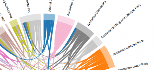
The connecting lines between parties show where one party has preferenced another in the top 25% of the ballot paper.
The width of the party around the circle shows how many other parties have preferenced it in the top 25% of the ballot paper.
This visualisation works by first grouping preference into group tickets for both parties and independent groups. It then works out the aveage position each ticket gives to candidates on each other ticket. If the average is in the top 25% of the preferences then we show it on the diagram. You can see if parties are preferencing each other or if the relationship is not symmetrical.
While this gives us a quick overview, in reality it's a lot more complex and the preference order is particularly important. For a full list of all preferences I recommend belowtheline.org.au. Also have a look at this visualisation by Open Australia.
There is some information on how I went about creating this site at this blog post. The visualisation code relied heavily on this example by Mike Bostock.
Visualisation using d3js by @peterneish, data from the Australian Electoral Commission, code on GitHub.